What is wayfinding signage? At its core, it is a system of visual cues, symbols, and directional indicators designed to help people navigate unfamiliar environments. Wayfinding signage can be used in various settings, such as transportation hubs, hospitals, shopping malls, and university campuses. What does this look like?
Case Study: Wayfinding Signage for Makers Sports Management
From its offices in Scottsdale, AZ, Makers Sports Management creates golf player brands from the ground up. The business leverages its hands-on expertise in the sport and media savvy to build the brand. This client recently hired our shop to outfit its offices with wayfinding signage in Scottsdale, AZ.

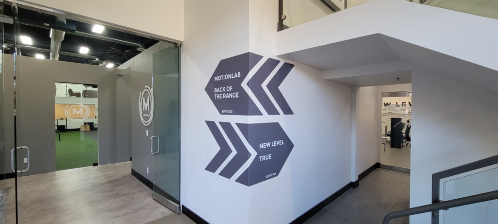
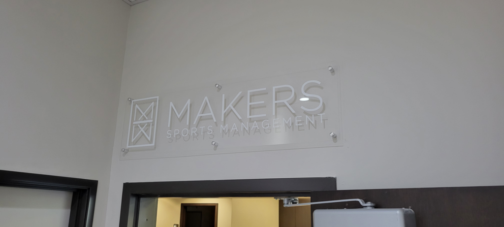
For this project, we designed, produced, and installed front window graphics, directional wall graphics, and an acrylic wall sign with standoffs. This sign package lets the client use wayfinding signage on three levels. The first one appeals to the would-be customer approaching the location. Window graphics on the front door glass panels show that the customer has reached the correct place.
In the hallway, brand-centric wall graphics guide the first-time visitor to the location they are looking for. These printed vinyl decals take advantage of a large corner section that would otherwise have little use for decorative touches. Finally, the wall sign consists of an imprinted, translucent acrylic panel we mounted with brushed aluminum standoffs. It combines the functions of a lobby and a building sign over an entryway.

This combination of wayfinding signage does an excellent job guiding visitors to the Scottsdale facility.
New to Wayfinding Signage? Here is a Wayfinding 101 Explanation!
You have seen the example of wayfinding signage; what could you do at your venue to enjoy similar success with this sign setup?
- Improve navigation. Complex environments such as airports, train stations, and hospitals overwhelm visitors. Wayfinding signage provides clear direction, reduces confusion, and helps people find their way quickly and efficiently. For example, signs with symbols for terminals, gates, and baggage claim areas can help travelers quickly move through the airport. In a business setting, any new location can confuse a first-time visitor and contribute to anxiety.
- Enhance branding. Wayfinding signs enhance branding by incorporating logos, colors, and typography. For example, a university could use its school colors and logo to create wayfinding signs that provide direction and reinforce its brand.
- Increase safety. Wayfinding signage improves safety and security in extensive facilities such as office buildings by directing visitors to the appropriate areas. Emergency exits and fire extinguishers can be marked with clear symbols and lettering, reducing the risk of accidents or injury.
- Provide accessibility. Accommodate customers with disabilities. Braille signs and tactile maps help individuals navigate your location, creating an inclusive visitor experience.
- Customer service. Wayfinding signage enhances the overall user experience. By providing clear direction, visitors can focus on their surroundings rather than being distracted by finding their way. This creates a more pleasant customer experience, increasing satisfaction and leading to repeat visits.

How does your wayfinding signage measure up? Do you use it to its fullest advantage, as our client did, or is there room for improvement? Work with our team to provide your visitors or customers with clear direction, creating the positive experience they want. Call us today for a free quote!
