Do you want to learn how to design exterior signs for Gilbert, AZ, venues? It does not matter whether you own a store, operate a non-profit organization or manage a service business. There are some signage tips that are simply universal. The technicians and graphic artists at Spotlight Signs and Imaging Solutions have put together this informative FAQ to help you along the path of imagining your ideal outdoor sign.
Q: Why is the design of a sign so important?
A: Your company’s name creates an impression in the mind of the consumer. In many cases, it is the display of your name and logo. Displaying it to its fullest advantage via your exterior building signage therefore makes sense.
Q: Should I include symbolism in my signage?
A: Indeed, the use of symbolism is perfect. You do not have a lot of time to catch the attention of a consumer. When this would-be customer is a motorist, you have even less time. Choose a symbol that stands out and perfectly embodies what your company is all about.

Q: How much wording is too much?
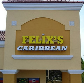
A: As a general rule of thumb, we suggest that you minimize the wording on your sign. A company’s name is about all that most businesses show off. That said, it is possible to enjoy the best of both worlds by selecting a box cabinet that lets you display your company’s name and logo in big, bold lettering and then offers a tagline in a smaller font underneath.
Q: Is there an ideal font?
A: Yes and no. Your type of business determines the appropriate use of font for your signage. Of course, there are some fonts that are easier to read for motorists driving by your venue than others. For example, script is a wonderful font for an old-world style bakery; even so, it is difficult to read for motorists. Serif is the type of font that is appropriate for virtually all types of businesses and easy to read for drivers. The higher the speed limit is in front of your store, the larger your lettering needs to be. A clear font ensures easy legibility.

Q: What role does color psychology play in signage making?
A: Color psychology is a real science that has proven to be immensely useful in the creation of interior designs and exterior signage. As a general rule of thumb, blue is a color that encourages purchases while green hints at environmentally friendly products or services. Our graphic artists are well known for their understanding of colors against the backdrop of attitudes and emotions.
Q: Where should I hang the sign?
A: Zoning regulations determine in large part where you may place your outdoor sign. Our exterior sign design tips for Gilbert, AZ, would be incomplete if we did not point out that most outdoor signs attach either directly above your entrance or toward the top or side of your building. Of course, if your company is located near a highway overpass with little traffic going past your entrance, a better choice might be a pole sign. Whenever possible, we suggest a higher mounting location rather than a lower one.
If you’re pondering over how your exterior sign should look, we can help with our graphic design services! Ready to change your look?