Poncho’s is a local institution. Located at 7202 South Central Avenue, the Mexican restaurant and cantina has been feeding hungry guests since 1972. As was the case with most restaurants during COVID-19, the dining room closed, and the staff served takeout only. The company took this opportunity to remodel what is one of the oldest restaurants in the area. Part and parcel of this project was exterior signage remodel in Phoenix, AZ.
Before Pictures Show an Ideal Candidate for a Brand Freshening
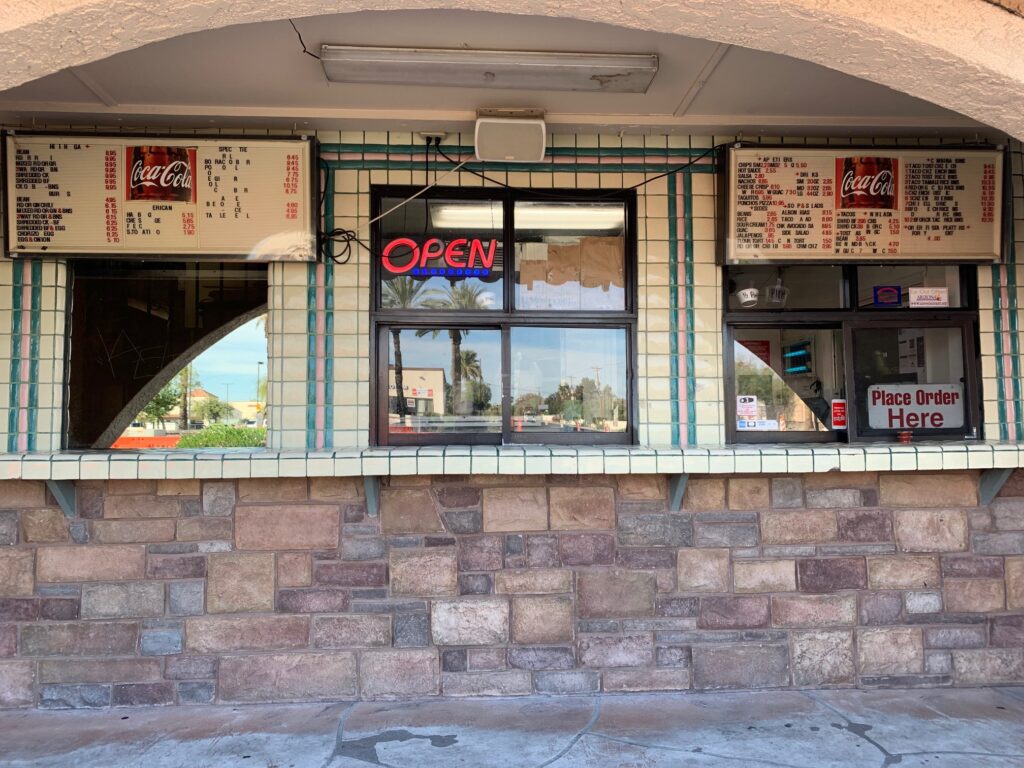
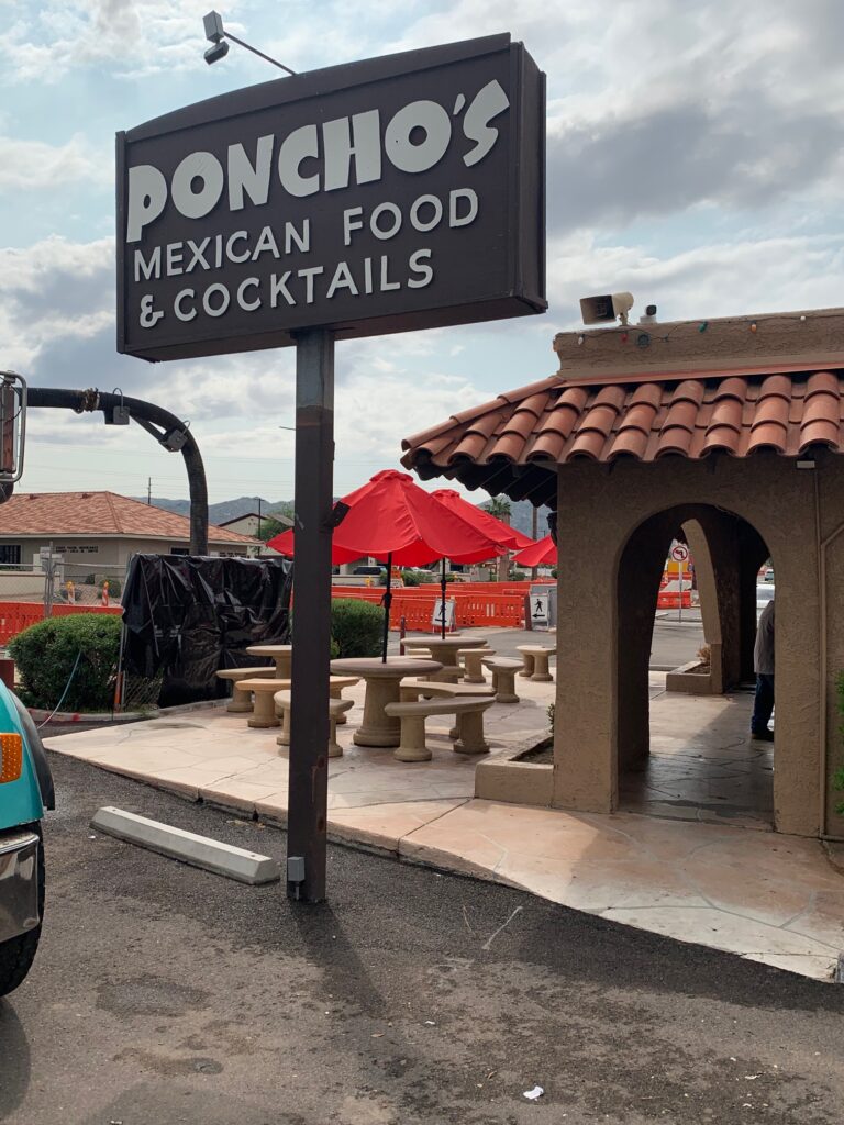
When you look at the restaurant’s photos on its website, you will notice that the opening photo of 1972 shows the same pole sign as the one we treated. Also, the menu signs with their changeable letters and numerals are best described as vintage. We discussed the signage update with the client, who wanted to focus more attention on branding.
After Pictures Detail Visually Attractive Exterior Signs That Invite Guests
The pole sign needed a new face. The structure itself was still in excellent repair. For this product, we used formed dimensional plastic letters. We mounted them to an aluminum composite face with a full-color laminated print overlay.
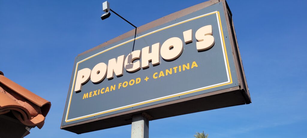
Notice the combination of white and yellow colors that perfectly contrasts with the matte blue backdrop. The three-dimensional letters stand out and are present with some shadow play, further drawing attention.
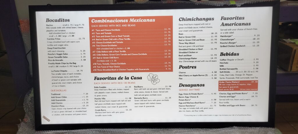
The menu boards underwent another distinctive upgrade. They are now backlit. Besides that, they have the attractive, clean look that contemporary guests are looking for when ordering takeout.
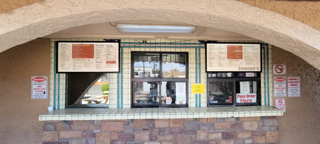
The orange and white print mix sets apart the combination meals from the stand-alone favorites. These new menus successfully showcase Poncho’s brand and its delicious menu. Since there are two boards with a color combination, they frame the takeout window and create spatial balance.
Freshening a Brand Successfully is Not the Same as Rebranding
Poncho’s is a local favorite. It does not need any gimmicks or much advertising. However, today’s business consumer appreciates the sleek lines of contemporary signage. Moreover, they like the look of brand-centric attributes. Therefore, it made sense that the client would freshen its brand presentation to be in step with progress.
It is important to point out that freshening a brand is not synonymous with rebranding. The latter refers to a change in the brand message that a company presents. This is not the case with Poncho’s. On the contrary! Guests and clients love the brand; it just needed a slight upgrade.
A complete rebranding typically refers to changing the company’s font, color palette, and logo – or just one of these elements. It is a noticeable difference that highlights a new attribute the company wants the consumer to note when making a buying decision.
Is It Time for a Brand Remodel?
Our shop routinely works with business owners considering exterior signage remodel in Phoenix, AZ. Please consult with our graphic artist to determine the look and feel of the signage you want the consumer to see. Because it is the first interaction with your brand for some of them, it could be a good idea to be brand-centric. Call us today to learn more about your options!
