Offering your patrons a welcoming environment includes the addition of ADA signs. In Phoenix, retailers and service providers recognize that the Americans with Disabilities Act (ADA) offers them some guidelines that make it feasible to adapt their markers with those who are disabled in mind.

Basic rules governing ADA signage
Meeting the basic rules of effective ADA signage additions is easy.
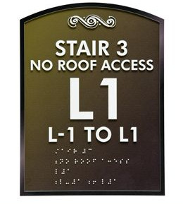
- Anti-glare coatings. Markers should have backgrounds and depictions that feature an anti-glare coating. This helps the visually impaired to better recognize the symbols on your signs when they are located underneath light sources or in the direct path of natural sunlight.
- Background and foreground contrasts. If your symbols are white, then your background could be dark green or blue. Conversely, if your symbols are dark, then your background should be light-colored. Visually impaired patrons have an easier time recognizing the message of your signs when there are stark dark and light contrasts.
- Basic fonts. Avoid calligraphic interior signage, thin lettering and other typeface choices that are difficult to read even in perfect circumstances. As a general rule of thumb, serif typeface is acceptable.
- Tactile signs. Contracted Braille should accompany the signage.
Other rules govern the exact points of signage installation, which ensures that Braille is easily accessible for those relying on the markers to be in certain locations.
What types of ADA signs should you order?
Depending on your business type, office or storefront setup, you are sure to have highly individualized signage needs. That said, there are a few markers that would benefit any kind of commercial establishment.
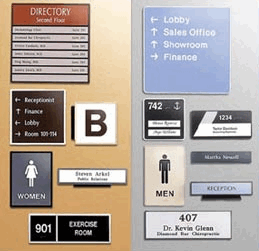
- Amenity signs. Identify the location of your bathrooms, drinking fountains, vending machines, cafeteria and waiting rooms with ADA signs. Generally, these are areas that will be sought out by staff members who know their ways around a building and visitors who do not.
- Exits. Help visitors to your business venue find the nearest exit easily and quickly. In the case of an emergency, this is a life-saving marker.
- Stairwell designations. Public stairwells, emergency stairs, escalators and elevators need signs that highlight their usage intent and location.
- Room designations. If you manage an office building or are in charge of ordering the markers for your office suite, it is a good idea to identify each room with a number. This makes wayfinding quick and simple. Certain rooms that serve a functional purpose – such as the copier room, the break room or the conference room – should not only have a room number but also a clearly spelled out designation. Use symbols whenever possible.
Remember that communicating on a number of different levels is a highly desirable approach when choosing ADA-compliant signage. Although most able-bodied consumers assume these signs to primarily benefit the visually impaired, remember that some disabilities are not as easy to spot.

For example, the individual who is unable to read must rely on symbols to navigate his way through a larger office building. For the person with a psychiatric disorder that makes communicating with others difficult, the combination of symbols and written text can be crucial. Contact us today for a free quote!

