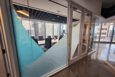
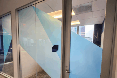
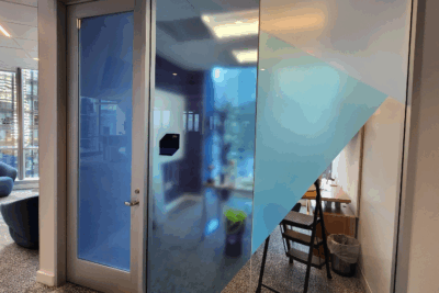
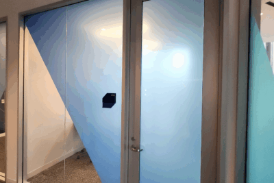
You do not have to choose between privacy and style in the office. Contemporary frosted and colorful vinyl window graphics easily bring privacy and aesthetics to your space. Cognizant in San Francisco loved this approach.
What are Frosted and Tinted Vinyl Window Graphics?
Our team frequently works with clients needing to boost privacy for conference rooms and other office spaces where floor-to-ceiling windows create a fishbowl effect. We use translucent vinyl with a frosted or etched appearance. Light shines through the material, which is sufficiently opaque to give you the desired privacy. Typically, this type of vinyl has a gray color.
That said, you may also opt for tinted vinyl window films. They are an excellent expression of your brand’s contemporary aspects. Available in a variety of colors, they can offer the same level of privacy as the standard gray frosted vinyl. Similarly, we offer full coverage, partial coverage, and branded applications.
Boosting Privacy Without Sacrificing Natural Light and Style
Frosted or tinted films obscure views while letting in light. They work well because the material diffuses the light to create a hazy effect. Colorful window films follow suit. When adding tinted vinyl, you have the added opportunity to reduce heat while maintaining natural light throughout the office.
Cognizant opted for this approach. As their 3D cube wall art for the office showcases, this client is not afraid to display a contemporary flair that is as functional as it is stunningly beautiful. We mixed frosted, etched, and tinted vinyl window graphics that occasionally overlap for a great look.
Explore the Aesthetic Appeal and Branding Opportunities
Custom-cut designs like logos, decorative patterns, and geometric shapes work well in almost every office setting. Cognizant favored geometric displays for its space and requested color tinting for ambiance and brand alignment. Concurrently, this approach to privacy film enhances the office’s visual interest without adding clutter, which makes it a contemporary favorite.
Enjoy Energy Efficiency, UV Protection, and Easy Maintenance
You already know that frosted, tinted, and etched vinyl window graphics allow for a quick office transformation without major renovation costs. Besides that, these types of products may also offer interior heat reduction benefits, protect interior furnishings from sun damage, and frequently lower cooling costs in summer. Compared to blinds, curtains, and factory-etched glass, the privacy film is easy to clean and maintain.
Work With Our Team on Your Next Contemporary Vinyl Privacy Film Design
If you are looking for frosted and tinted vinyl window graphics, our team can help. We gladly assist you with choosing the right design for your space, manufacturing the products in-house, and providing you with a professional installation.
Contact us today to request a free quote!


