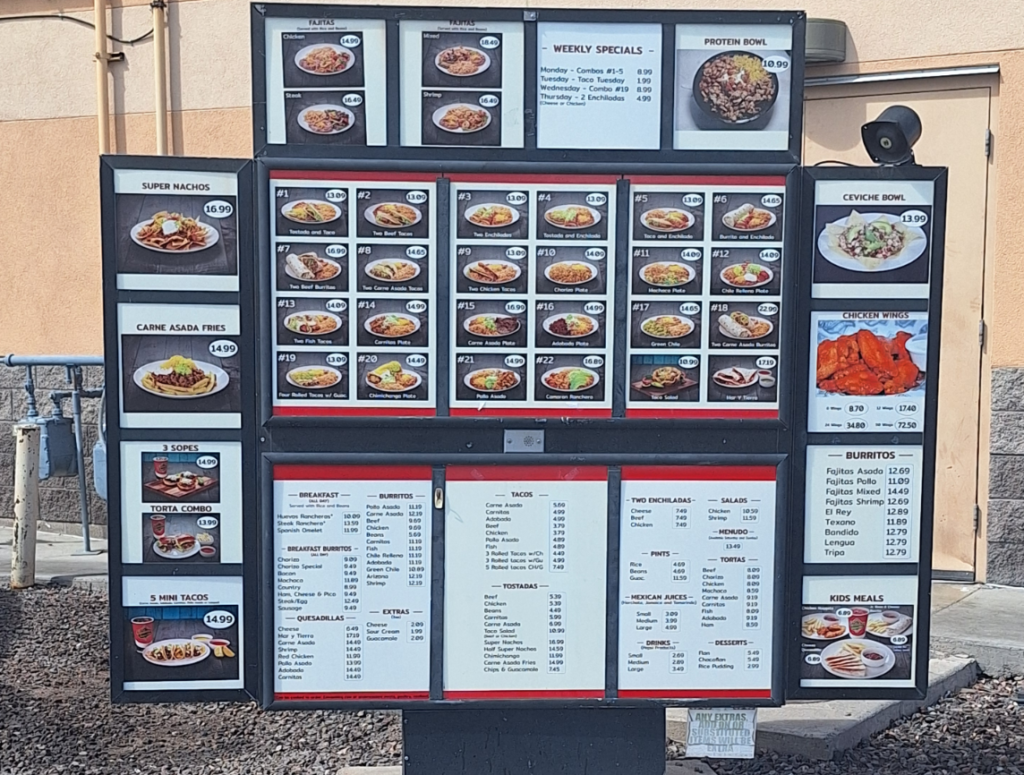
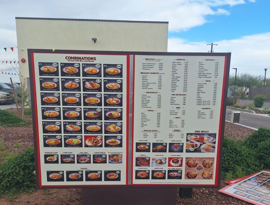
Federico’s Mexican Food is a returning client. A few years ago, our team assisted the business with updated drive-thru menus. The client returned to us because it was time to make changes and updates to their menu again. We gladly assisted with menu board design, printing, and installation throughout the valley.
Changes to the Menu Necessitate New Menu Board Facings
Because Federico’s is a returning client, we had their specs on file. It made designing and printing the new faces for the menu boards quick while ensuring brand continuity. The client requested the use of vibrant colors that catch the eye. To make ordering easy, combination meals can be ordered by numbers. Moreover, the cost of each meal is displayed along with a photo of the dish. Look for the updated menu boards all across the valley at the restaurant’s many locations!
What Goes into Designing a Restaurant Menu Board?
When we work with clients on putting together a menu board that sells, it is not merely about listing dishes and prices. Instead, the menu board is a highly effective tool for advertising and brand building. A well-designed menu board entices customers, conveys the restaurant’s personality, and drives sales.

How do we do it?
- We understand your brand. Before beginning any design, our graphic artist works with you to understand your restaurant’s brand identity. Is it upscale and sophisticated or casual and cozy? The menu board reflects this identity through design elements such as color scheme, fonts, and graphics.
- Determining the visual hierarchy. During the design phase, we arrange menu items in a logical order that guides the guest’s eye. We highlight signature dishes or specials using size, color, or positioning. Also, the most profitable items receive the most prominent placement.
- High-resolution photos. We incorporate mouth-watering images of your dishes. They stimulate the appetite and encourage impulse orders. Some clients work with professional food photographers to showcase featured dishes in the best light.
- Appropriate font selection. For a drive-thru, select fonts that are easy to read from a distance and align with your brand’s aesthetic. We recommend not using too many different fonts because they clutter the face with design elements.
- Limit text whenever possible. It is tempting to highlight your food’s quality with a small paragraph for each dish. However, customers are easily overwhelmed, particularly in the drive-thru setting. We can help you keep menu descriptions concise. If you like, we can design a second menu board for the inside, where we can focus more on each dish’s key ingredients or unique selling points.
- Leaving room for specials and promotions. Look closely toward the top of the drive-thru board, and you will notice that we left some space for a changing weekly special. This can be a preprinted image with an eye-catching graphic that you update with handwritten information as needed.
Our Team Specializes in Menu Board Design, Printing, and Installation
Designing a restaurant menu board for maximum advertising and brand building calls for a thoughtful approach that balances aesthetics, functionality, and brand identity. Our team helps guide the guest’s eye with lettering and graphics. If you are unsure whether your current menu board is featuring your dishes in their best light, invite us for a site survey. Call today!


