Office directory signs in Chandler, AZ, must combine functionality with great looks. In larger settings, in particular, the ability to add and remove tenant notations is a big plus. What are your product options when you want to purchase the type of signage solution that is ideal for your setting?
For Smaller Venues: Directories with Changeable Inserts
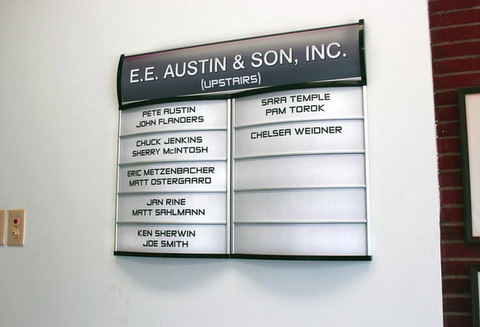
Slightly curved directories are visually pleasing and easy to read for the building’s visitors. When you have five tenants or less, we recommend the installation of a directory with sliding, changeable inserts. If a tenant leaves, just turn insert a branding or marketing message in the space. Commission a product that is large enough to imprint the business’ name as well as the suite number.
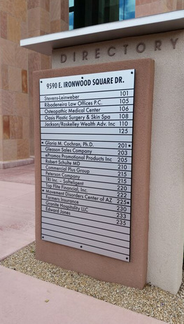
Midsized Settings: Tall Directories with Removable Inserts
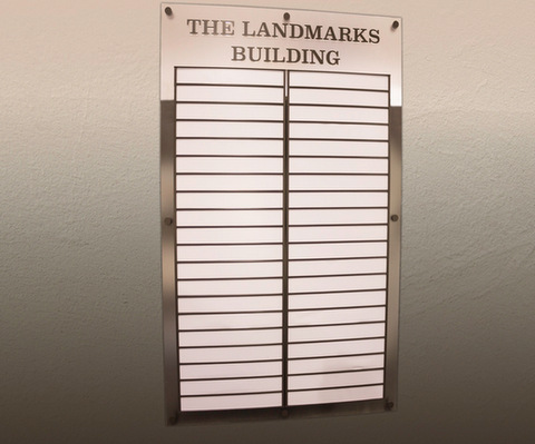
For a three to a five-floor building, it makes sense to invest in tall directories. Since the names of tenants display with smaller print, we recommend leaving blank spaces for empty suites. Savvy building management companies have begun asking us to imprint “for lease” on the backs of the removable inserts so that they can advertise available spaces while removing a name to avoid confusion. Our clients have had excellent success with the display of two directories, side by side, that feature alphabetical client listings on one half and numerical suite number listings on the other.
Large Buildings or Multiple Properties: Freestanding Pylons
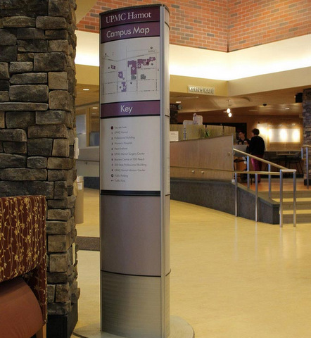
Freestanding directory signs offer the advantage of being accessible from two, three, or four sides – depending on the pylon’s design. We recommend the display of a floor-by-floor tenant listing. Add a panel for highlighting the major tenants in the other buildings. For a hospital setting, this could include the names of the departments or specialty offices.
Optional Design Elements for Office Directory Signs in Chandler, AZ
Like any other signage product, you can dress up your directory to take it from functional to full of pizzazz.
- Branding message. Display your company’s name and logo at the top of the directory as well as the building’s address at the bottom. Acting as a frame, this setup gives the sign added definition.
- Safety warnings. In smaller settings, it is possible to include a panel with an EVAC map as well as a floor plan. Doing so has the added advantage of making it easier for folks wanting to take the stairs to orient themselves.
- Non-glare finish. When the noon sun or overhead lighting casts a glare, it makes the directory difficult to read. Anticipate this problem and counteract it with a non-glare finish.
- Tactile graphics. Add Braille II and tactile graphics to assist your vision-impaired visitors with wayfinding. Sharp color contrasts are another great option to add to this design.
Of course, there are still additional design and style elements that can take this signage from good to great. Examples for Chandler AZ include end caps featuring wood, textured acrylic or brass. Contact us today to learn more about your product options and to commission a directory that is sure to set the tone for client and customer experiences at your venue.