When entrepreneurs ready their companies to welcome clients, investors and – in some cases – competitors, they first ensure the installation of excellent exterior and interior signs. In Phoenix, AZ, we recently worked with Red Audience, a digital marketing company that focuses on supporting businesses and political candidates by reaching millions of people each day on their behalves.
A New Signage Collection Markets and Brands the Business
After discussing the business’ signage requirements, we worked with the management team to put together the right color selection and look. In the process, we created four distinct products.
Building sign. The building sign consists of flat cut metal letters that present with a depth of 0.25 inches. This offers a slightly 3D appearance. We painted these letters black and stud-mounted them to the wall.
Monument panels. These panels welcome motorists. Made from routed aluminum, we backed them with white acrylic for easy readability.
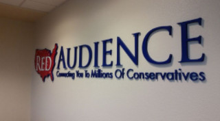
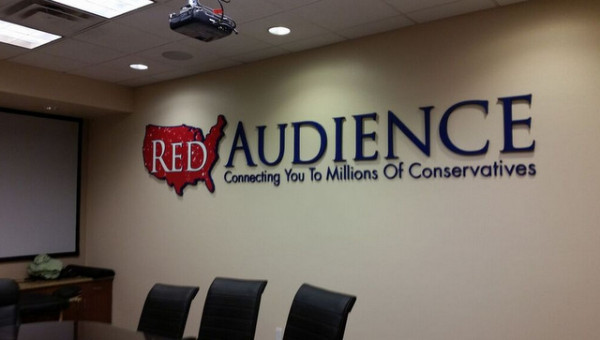
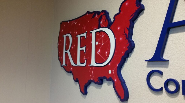
Lobby and conference room signage. Going for the gusto, the management team decided on dimensional PVC letters and a logo display that followed suit. We created a digital print overlay for the map logo. In a clever ad decision, we fashioned white dimensional letters that spell out the word “red.” The lobby sign measures 10 feet in width while the conference room product is 14 feet wide.
Additional signage products that await manufacture include window graphics and a directory sign.
Making an Excellent First Impression with Your Signage
Red Audience targets consumers in search of a conservative market. Underscoring this business model is easy with the display of red, white and blue colors you see on the interior signs. For your company, the combination of colors and materials is most likely going to be different. How can you use them to make an excellent first impression on the demographic your business is targeting?
Material selection plays a huge role in this case. Allow the material you select for your signage to hint at your company’s philosophy. It is no accident that firms in the financial sector favor metals, which signify durability and longevity, while clothing boutiques prefer acrylics for a trendy look. The color selection is largely determined by your company’s colors as well as the hues you chose on your website.
Finishing Touches Complete the Picture
When you commission exterior and interior signs for Phoenix, AZ, companies, pay close attention to the finishing touches you select. Examples include the brushed satin versus high-gloss finish as well as the mounting method for the markers. High-tech companies favor aircraft cable wires that augment a chrome and glass interior. Architects like the offset mounts that allow for behind-the-sign illumination.
Discuss your vision for your signage suite with our graphic artists. We work with you to see your vision become reality via sketches that display your signs in minute details. See these products in the same way that a first-time customer or client at your venue will take in the signage. When you are confident that you have found the right material, display method, and mounting choice to communicate your brand, we handle the manufacture and installation. Contact us today to get started on your project.


