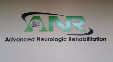
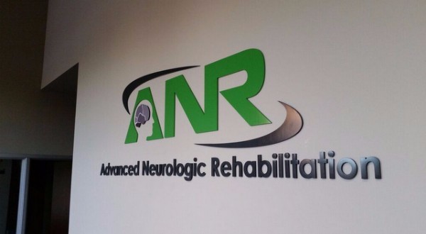
Located at 1447 West Elliot Road in Suite 101, Advanced Neurologic Rehabilitation (ANR) offers physical, occupational and speech therapy as well as Yoga sessions. When the office’s management team needed to order lobby and building signs for medical centers in Gilbert, AZ, it contacted our graphic artists for assistance.
Designing a Look that Brands
While discussing the ideal signage setup with the team, we suggested a lobby sign design that would mimic the name and logo appearance on the office’s website. After receiving approval, we proceeded to design, manufacture and install 0.25-inch flat-cut metal letters for the lobby sign and logo. We used paint for the signage letters and a digitally imprinted vinyl overlay for the brain portion of the logo. Doing so allows for a detailed reproduction of the website’s look.
For the exterior building sign, we installed 0.25-inch laser-cut, acrylic letters that we painted black. This color perfectly matches the shade of the impressive door that leads to the office. Also, it contrasts well with the façade. Illumination is provided by built-in spotlights that are situated in an overhang right above the signage. At any time of the day and night, these letters stand out and offer wayfinding assistance to the consumer. At the same time, they communicate the brand effectively to those who have visited the medical office’s website as well as to those who have not.
Details Make a Sign Stand Out
A discussion among sign makers questions the wisdom of intricate signage. We firmly believe that the right detail work makes a sign stand out. The use of unneeded decorative touches, on the other hand, causes the marketing and branding messages to get lost. For example, the logo portion of the ANR lobby sign features a detailed display whereas the same part of the exterior sign is presented in the same color as the rest of the sign with the details omitted. Doing so was not an accident.
It is a perfect example of a detail that would have distracted the consumer from the branding message. That said, font changes and ornamental signage aspects heighten brand awareness. For this reason, we ensured that they would be an integral part of the exterior sign as well as the one we mounted on the interior. Working with a sign professional who knows about this distinction clearly makes a world of difference when you present your business to the consumer.
Choosing Acrylic for Your Exterior Signage Needs and Metal for the Interior
Whether you select building or lobby signs for medical centers in Gilbert, AZ, or for any other kind of company, consider the acrylic and metal combination. On the inside, metal takes on a substantial feel that easily translates into a branding message bespeaking the longevity of the company, its reliability and its commitment to superior quality. On the exterior, acrylic works well because it is so durable and easy to clean. Of course, you may also opt for metal building letters that put this branding message on the outside of your venue. Contact us today to learn more about your sign options.


