There are 24 Federico’s Mexican Food restaurants in and around Phoenix. The venue offers an authentic meal experience with drive-thru convenience. When the eatery wanted to refresh its restaurant drive-thru menus in Phoenix, AZ, our sign shop assisted with the project.
Drive-Thru Menu Signs Focus on Pizzazz and Adaptability
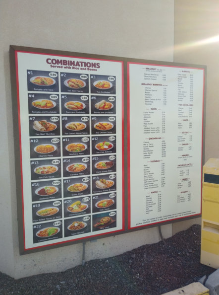
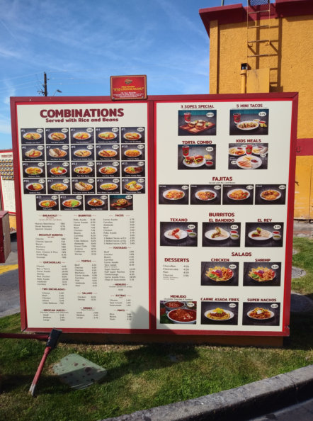
The eatery assigns a number to its various combination platters to make ordering quick and easy for the hungry guest. Moreover, it focuses the consumer’s attention on the look of the food rather than the name. On the other side of the menu board, the guest sees additional sides, drinks, and extras that are displayed by name.
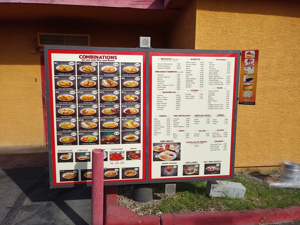
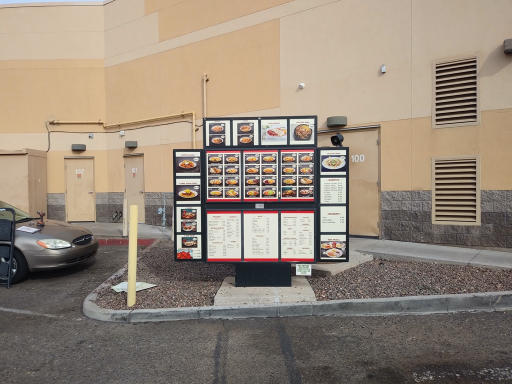
Both sides of the menu signs feature prices. Because drive-thrus want to make ordering easy on the guest, the first set of signs is near the entrance. Waiting consumers can make their selections. As they pull around the corner, the ordering panel repeats the information the guest has seen on the initial sign.
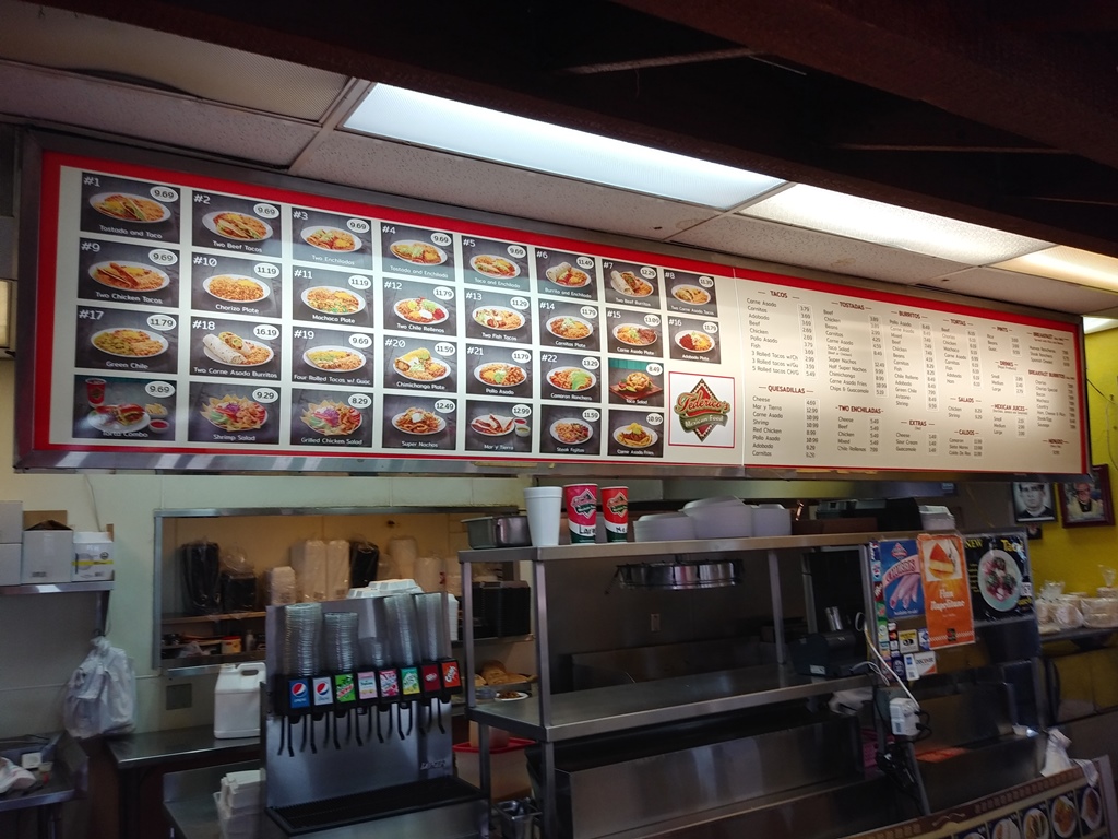
Our technicians refreshed the signage of this panel to feature new colorful fronts. It is interesting to note that the menu board on the interior reflects this freshening up of the signage. It imbues the space with a contemporary look and feel. At the same time, it makes changes to pricing structures and menu items a snap.
Maintaining a Strong Foothold in the Local Business Community through Signage
You have an already established business. Maybe it is one location. Then again, you might have multiple venues open to serve the consumer. Each site is a part of the local business community.
However, did you know that the face of the business community regularly changes? As company owners make changes to facades and signage products to stay in step with changing tastes of the consumer as well as evolving demographics, it is essential to maintain your own brand’s pizzazz and contemporary vibe.
Signage is one way to keep up.
- Menu boards. Take a page from the playbook of Federico’s Mexican Food and update your menu boards. Maybe you need to make a small change to the color play, the layout, or the price points. Now is a great time to do so.
- Lightbox cabinet panels. If your building sign is a lightbox cabinet, consider the panel front. Does it still encapsulate your brand message? Maybe it is weathered and no longer looks great. Replacing the panel is a quick and inexpensive process.
- Wall wraps and graphics. Do not forget the interior of your storefront, restaurant, or office. What do consumers see as they enter? Is it a brand-centric presentation that encourages them to do business with you? If not, the addition of wall graphics and wraps can make a significant change.
Ordering Restaurant Drive-Thru Menus in Phoenix, AZ
We have a long track record of working with restaurant managers, franchise owners, and other business clients. Our technicians specialize in the design, fabrication, and installation of signage that looks great, saves you money, and embraces your brand. Contact us today to schedule a design consultation!
