When your clients first see your lobby sign, do you know what their reactions are? Are they surprised? Do they feel like their expectations of your office have just been met? Are they questioning whether they made the right choice when picking your business? Choosing the perfect lobby sign is a mix of art and science. To make it a bit easier, here is the one-stop guide to lobby signs for Gilbert, AZ, which Spotlight Signs and Imaging Solutions shares with its customers.
Decide on the First Impression You Want to Make
Do you want your clients to see you as an avant-garde business that is always a step ahead of the cutting edge? Do you like the idea of having clients think back to your decades in the business when visiting your office? Are you intending to present yourself as a non-nonsense corporate heavy hitter? Expressing yourself in this manner is possible by the interior design choices you make when outfitting your reception area. Part of this effort is your lobby sign. When you are clear about the impression you want to make, it is easier to make more detailed signage design choices.
High-tech, No-frills or Something Else Altogether?
Plenty of options promise you success in your quest for the perfect sign.
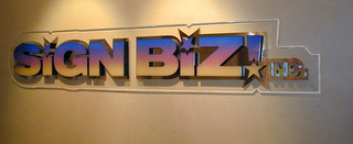
- High tech markers. Imagine the use of two acrylic boards. In between, we place printed acrylic lettering. We also place printed logo and design elements on top and behind the boards. Conversely, use acrylic boards and letters for artistic 3D design images that give your lobby sign a high-tech look and feel.
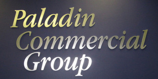
- Basic lobby sign design. The no-frills approach is suitable for the office that wants to highlight its longevity in the niche. For example, accountants and attorneys favor the look of the sign that uses nothing but metal – or metal tops and foam substrate – for a name display. This approach also works well for companies in the technology sector.
- Alternative lobby markers. There are now companies that are stepping away from the traditional lobby sign. Wall decals, graphics and lettering are taking the place of the sign that separates itself from the wall surface. Some businesses have had great success with the incorporation of the lobby marker in an artistic mural. Others have playfully insinuated themselves into famous settings via a printed photographic mural with a printed logo and company name overlay. The options are truly endless.
Elements of Successful Lobby Signage
No matter what type of marker you choose, there are some universal style elements that each business should incorporate. In addition to the company name, it is always a good idea to add the logo as well. Since the name and the logo go together during branding, it makes sense to continue this trend even in the reception area.
A secondary style element that occasionally gets forgotten is the artistic backdrop. If you are paying someone to professionally design the reception area, this expert will work to add artistic touches that underline the message of the lobby sign. If you are doing the reception area setup yourself, consider carefully the addition of print art, plants and lighting to bring out the sign as the focal point on the wall.


