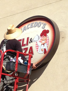
Restaurant exterior building signs for Gilbert, AZ, eateries have the power to bring in the customers. Just ask the friendly folks at Macedo’s Deli & Pizza! Located at 1614 North Higley Road in Gilbert, the motto “It’s All Good” describes in equal parts the laid back atmosphere of the restaurant as well as its yummy food choices. When it came time for the pizza parlor to add new building signage, the management team contacted Spotlight Signs and Imaging Solutions.
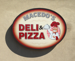
We discussed the company’s motto, took in the atmosphere and designed a sign that highlights the Italian origins of many dishes on the menu. A cartoon character that reminds of traditional pizza chefs holds a covered plate. At the top is the business’s name while the deli and pizza notation is toward the side of the oval. The sign is offset from the wall, which makes it quite eye-catching for passersby. Since the edges of the marker are darker than the building façade’s color and any hues inside the oval, it stands out beautifully.
Are you thinking of adding or upgrading your restaurant or pizza parlor exterior building signs? For Gilbert, AZ, business owners, this signage is serious business. How can you ensure that your marker brings in the customers? How can you incorporate hints of your atmosphere into the outside sign? Answers to these questions are surprisingly simple.
- Work with an experienced signage company. When getting noticed is a top priority, only a sign company that has plenty of experience can meet your needs. Since market preferences change quickly, this company should have been around long enough to see – and deal with – at least a few of these changes and understand how they affect the design of exterior building signs for the hospitality industry.
- Put your atmosphere in pictures. If you do not yet have a logo that illustrates the tone of your venue, now is the time to design one. Pictures quite literally speak louder than a thousand words, and you can communicate a formal, laid back or quirky setting and friendly atmosphere with the use of a graphic.
- Boil down your message. Even if you have a great motto like Macedo’s, it may not be a good idea to put it on your sign. Depending on the size of the marker, the amount of lettering and the number of graphics, too much writing could be overwhelming for the eye. Opt for larger letters to fill the space instead. This immediately makes it easier for motorists to identify your location. Nothing will cost you as much business as a driver who misses your venue and opts to just keep going until she or he finds a similar eatery.
When you talk to our experienced graphic artists, we will work with you not only on the design of the marker, which ensures that your signage stands out from the crowd, but we also make certain that it meets all the permitting standards set forth by your landlord and the city.


